
CUPERTINO
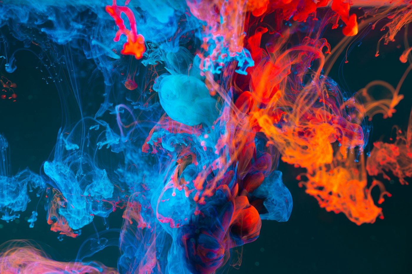
Apple Music has a new look, and for once the design story is not about software at all — it is about a tank of liquid, a glass floor and a bass note. MacRumors reported on Wednesday, October 21, that Apple officially introduced Apple Music's new brand identity in a YouTube video, and the concept is right there in the phrase Apple keeps using: the visuals were "made by sound." AppleInsider reported the same launch later that morning, describing a process in which sound was played through liquid with the brand elements sitting behind the vibrating liquid, producing the rippling, liquid-inspired look that will now introduce Apple Music videos.
Here is how it actually worked, because the mechanics are the whole point. According to AppleInsider, notes were composed as a sonic mnemonic — a short musical signature for the brand — and those frequencies were played through a transducer into a tank of mineral oil positioned over an etched Apple Music logo on a glass floor. The ripples distorted the logo beneath, and the whole thing was captured entirely in camera. No simulation, no render farm: physics did the design work. The resulting footage becomes the sting intro for Apple Music videos, and a two-note overlay will appear on concert videos. The FADER reported the identity launch on Wednesday as well, and if the method sounds familiar, it should — the team notes that Apple TV's rebrand used a similar practical, in-camera approach.
The collaborator list tells you how seriously Apple took the sound half of "made by sound." MacRumors and AppleInsider both reported that Apple partnered with British producer Fred Again.. — stylized fred again.. — and with NEST Acoustics on the project. Think about that pairing for a second: one of the most influential electronic producers working today, a specialist acoustics outfit, and a brand team willing to build a logo treatment out of vibrating oil. Fred Again.. built his reputation on turning fragments of real life — voice notes, found audio, everyday sound — into euphoric records, which makes him an almost suspiciously perfect fit for an identity literally built from real sound behaving in the real world.
The look itself is a genuine break from what you are used to. According to The FADER's report, the new identity moves to a black-and-white scheme, replacing the red and pink that have defined Apple Music's visual world for years. The logo gets chunkier, and the wordmark sets "music" in all lowercase with a heavier, rounder, tighter type treatment. That is a lot of change at once — color, weight, case — and it signals that Apple wants Apple Music to read less like an app icon and more like a music brand that could sit comfortably on a concert film, a festival screen or a vinyl sleeve. Black and white is also a flex: it says the identity does not need color to be recognized.
The timing is not an accident, either. The new identity pairs with Apple's Liquid Glass design language of the iOS 26 and macOS Tahoe era — an interface philosophy built on translucency, refraction and surfaces that behave like physical material. An identity made by filming real liquid is basically Liquid Glass with the metaphor removed: instead of software imitating liquid, Apple pointed a camera at actual liquid and let it move the logo. MacRumors reported that the full rollout is expected with iOS 27.2 and macOS 27.2 next week, which means most listeners will meet the new look as a software update first and a brand film second.
Sharp-eyed users actually got a preview weeks ago. According to MacRumors, the new logo and icon were first spotted on October 6 in the macOS and iOS 27.2 beta 3 releases, and the identity was first unveiled in person at the Apple Music Hall opening in Battersea, London last month. That sequencing — beta sighting, physical unveiling at a music venue, then a full public launch film — is a very Apple rollout: the design escapes into the wild just enough to start arguments, then arrives officially with a story attached. And the story matters here, because a plain logo redesign is a shrug, while a logo redesigned by playing Fred Again.. through a tank of oil is a headline.
It is worth pausing on why Apple keeps choosing practical effects for these rebrands. In an era when any identity can be generated, rendered and focus-grouped in perfect digital smoothness, filming sound waves bending a logo through mineral oil is a deliberate inefficiency — and that is the message. Music, Apple is arguing, is a physical thing: pressure waves, vibrating air, rooms that shake. An identity born from an actual transducer and an actual tank claims a kind of authenticity that a gradient cannot. Whether you find that moving or marketing depends on your tolerance for brand poetry, but the craft is real either way. The ripples in that sting are not an artist's impression of sound. They are sound, photographed.
What changes for listeners day to day? Mostly the frame around the music rather than the music itself: the sting at the top of Apple Music videos, the two-note overlay on concert videos, the chunkier logo and lowercase wordmark showing up across the app and the web as the 27.2 updates land. The red-and-pink era quietly retires. If you shoot or post concert footage through Apple's ecosystem, that two-note overlay is the piece you will actually hear in the wild, the audio equivalent of a watermark — a tiny mnemonic designed to lodge in your head the way the best sonic logos do.
There is a risk in all this, and Apple knows it: black-and-white minimalism is the most imitated move in modern branding, and a heavier lowercase wordmark will inevitably draw the familiar complaint that every brand looks the same now. The defense is the process. Plenty of services can go monochrome; only one of them can say its identity was performed — that a producer composed notes, an acoustics team tuned frequencies, and a camera recorded liquid doing the rest. MacRumors and AppleInsider both treated the method as the story, not a footnote, and they are right to. Next week, when the update lands and that rippling sting plays before a concert film, you will be watching a logo get pushed around by music itself. As brand metaphors go, that one is at least honest.
More from the culture and tech lanes on our news front, and catch up on the day's music news with Lil Baby's fresh album announcement and Charli XCX's Glendale cancellation and Las Vegas finale.